Making an AI Learning Interface More Intuitive
September 2022
This study was conducted at the HCI/UX lab housed within the College of Engineering and Computing at a large research university. The lab director is an associate professor, and, besides myself, the team consisted of undergraduate students and M.S. students from the IT department.
Background
ALLURE is an AI interface that helps users learn how to solve a Rubik’s cube through a chatbot and interactive design features. The lead developers wanted initial feedback on how well their prototype helped users solve a particular problem (the "white cross") before incorporating other solutions.
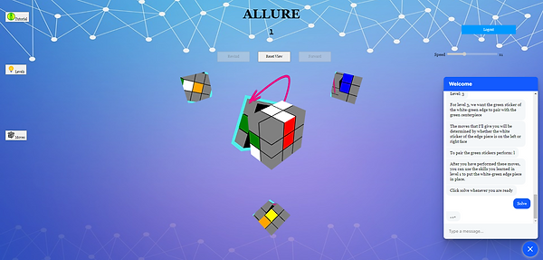
Screen capture of the prototype version of the interface. 3D cube is in mid-rotation with arrow and highlighter. Chatbot is offering written instruction for solving Level 3.
Summary of Insights
-
The word "level" combined with the numeric label falsely led users to believe they were moving through the instructional stages chronologically and in increasing difficulty.
-
Participants ignored the Speed Slider and the “Reset View” button because they did not understand their purpose.
-
Most users in this study found the chatbot instruction redundant or unnecessary alongside the other multi-modal features.
Constraints
-
The turnaround for this study was shorter than expected because the developers required additional time to finalize the prototype, which ate into the initial start date for testing. The research faculty also needed results and recommendations quickly to meet a publication deadline.
-
All of the moderators were full-time students, so no team member could be present at all 10 usability studies. However, the studies were audio-recorded and transcribed, and the users’ screens were recorded during the usability test so each team member could watch them after the fact.
Process
First, we met with stakeholders and identified key research questions
The research team and the lab director met with the faculty members who were spearheading the ALLURE project. They articulated the data points they wanted at this point in the development process, and I turned them into research questions we could use to guide our study design and interview questions.
-
Ex. Data point: Usability of the chatbot
-
Research Question: How does the chatbot instruction affect users' ability to solve the white cross?
Then we solicited and screened participants
Each member of the team recruited participants through university email lists and platforms in their respective academic circles, since the target users for the initial prototype were students aged 18 and older. Those who expressed interest were asked to fill out a screener through Excel. Another team member randomly selected 10 participants and coordinated the schedule from there.
I created a task list and interview questions that addressed stakeholders' data points
Initially, the task sheet asked participants to complete certain actions, like “Initiate the chatbot” and “Click the ‘rewind’ and ‘forward’ buttons.” However, to avoid skewing the users' natural interaction with the interface, I suggested revising to, “Use ALLURE to help you solve the white cross."
I also drafted some questions to ask users after they completed the usability test, and that would inform the stakeholders' data points. For example, if participants had previously interacted with instructional material for solving a Rubik's cube, I would ask, "How was the chatbot instruction on ALLURE more or less helpful than [other method] you have referenced in the past?"
I moderated usability tests
Each member of the research team moderated 2 usability tests, and at least 2 other team members observed each test. During the tests I moderated, I read through the task list and asked users to verbalize their thoughts as they moved through the interface, while the observers took notes on users' behavior. When I was observing others' tests, I noted that participants took notes on the chatbot instruction and repeatedly clicked the “Reset view” button when the cube was already in the starting configuration.
I conducted follow-up interviews
I conducted a semi-structured interviews with the two students I initially ran the usability test with to inquire further into their feelings about particular features of the interface, including the highlighter tool, arrows, animations, and chatbot instruction.
We discussed our initial observations
After each day of usability testing (2 total), the research team met to share our notes and identify the most pressing pain points that surfaced throughout the usability tests and follow-up interviews.
Finally, I coded the data
Another team member and I performed thematic analysis to identify patterns in participants’ think-aloud protocol and interview responses. We coded the data individually and then merged our codes to ensure a higher inter-rater reliability.

A white board from our team meetings with common pain points
Insights
-
People associate ascending numbers with chronology and increased level of difficulty and find it confusing when those expectations are not met. In this prototype version, users learn to solve the white cross from 9 different starting configurations, and each series of steps is labeled from “Level 1” to “Level 9.” The word “level” combined with the numerical label led users to believe they needed to complete each level in order, and that each one would increase with difficulty. If users find level 4 too challenging, and believe the next 5 will be even more challenging, they’re likely to give up and exit the interface.
-
If people do not immediately understand the purpose of certain features, they will ignore them. The ALLURE prototype had a speed slider that controlled the pace at which the chatbot instruction was delivered, and a button to “reset” the virtual 3D cube to its starting position after it had been manipulated. However, users did not understand what the speed slider controlled or what the “reset” button was meant to reset. At times, users did not notice these features until the end of the study, or ignored them altogether. Meanwhile, they commented on the quick delivery of the chatbot instruction or tried to restart the level by repeatedly clicking the "Rewind" button. Without context, users miss out on potentially beneficial features that would reduce frustration and increase their success in solving the white cross from various configurations.


Close ups of the speed slider and Reset View button
3. People have different learning styles and preferences for how they receive information. Most users in this study found the chatbot instruction redundant or unnecessary alongside the multi-modal instruction. They preferred the arrows, highlighter, and the animation of the 3D cube, and did not feel the written instructions affected their ability to solve the white cross. Future users may prefer the written instructions, either instead of or alongside the other features. However, some users might feel more engaged if they had the option to minimize the chatbot and move through the interface using the multi-modal features alone.
Impact
With these insights, the developers changed the name of the levels to “scenarios” and clarified that they represented standalone configurations. They also added an explanation of the slider control and “Reset View” button in the tutorial.
In the next round of testing, users were twice as likely to solve the white cross problem, and overall satisfaction scores increased from 3.3 to 4.1.